At PUREBLEND CBD, we embarked on a journey to create a brand that caters to the needs of individuals aged 30 to 60, including athletes and regular people seeking anxiety control. This case study explores the step-by-step process of crafting the brand, from conceptualization to design and application.
Defining the Vision.
Our aim was to develop a brand that stands out in the competitive CBD market. By extracting THC and focusing on the most valuable components of the formula, PUREBLEND offers a pure and potent CBD product with proven benefits.

We had the opportunity to start from scratch. Carefully selecting colors and visual elements from a wide range of options, ensuring they represented diversity and nature.
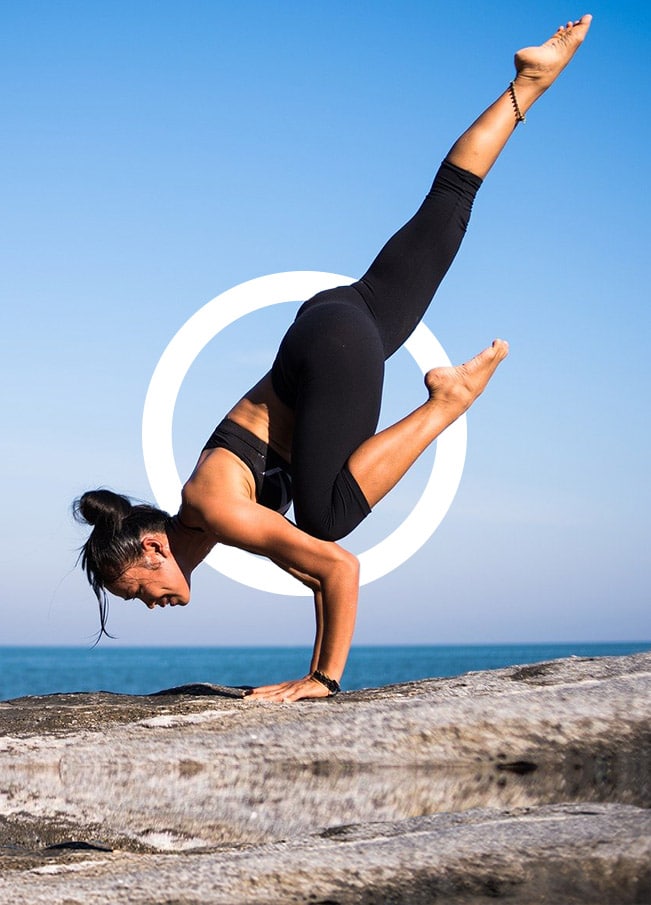
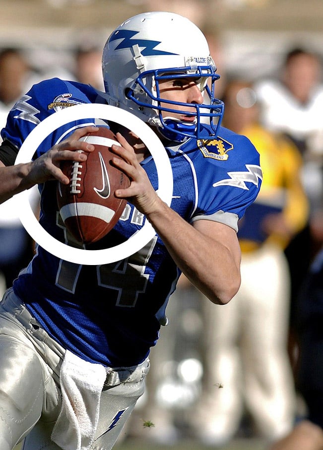
The circle, as the most natural and perfect geometric shape, became a key element of our brand identity.

Compilance and Benefits
As a CBD product, PUREBLEND adheres to strict regulations. While not classified as medicine, it offers positive side effects for anxiety relief, depression, epilepsy, Parkinson’s disease, and alleviating the effects of traditional cancer treatments. Our brand prioritizes safety and efficacy.

Selected Materials
To preserve the product’s quality, we chose glass bottles that are enclosed in UV-resistant boxes. This ensures that the enzymes and components of the formula remain protected, maintaining the utmost potency for our customers.

Regulations and Info
Dosage instructions and regulatory information are prominently displayed on the sides and back of our packaging. We prioritize transparency and provide customers with all the necessary information they need to make informed decisions about their CBD usage.

Archetype:
The Heroine.
The archetypal Heroine is a symbol of strength, resilience, and selflessness. Found across cultures, she saves the day and sacrifices for others. Intelligent and spirited, she’s a resourceful problem solver with a sharp mind and quick wit. Challenged in quests for love, family, or justice, she restores balance to her world.
As the protagonist, her journey becomes ours, inspiring others, especially women, to see their own potential. She demonstrates equality in succeeding, leading, and standing up for what she believes.
The Heroine breaks stereotypes, showing that women are equally capable in every aspect of life.
Each color includes everyones lifestyles.
The Logotype.
The logotype for the CBD producer brand is a visually striking design centered around a perfect circle. It features a clean font creatively integrated within the circular shape. Symbolizing perfection and balance, it represents the brand’s commitment to natural, high concentration CBD without THC.
Earthy tones and subtle natural elements enhance the organic and holistic image, conveying purity, potency, and the brand’s message in the competitive market.


The brand identity reflects the values of purity, efficacy, and nature.
The creation of the PUREBLEND CBD brand involved meticulous planning, innovative design, and a commitment to providing a high-quality CBD product to our target market. We believe that through our brand, we can make a positive impact on the lives of individuals seeking holistic wellness solutions.
Package Design
We must bear in mind that branding is closely related to the objectives of the product, the market it is aimed at and the public it wants to win over. In this case, the CBD product is a preparation of natural essences that is widely known as an agent that facilitates a state of mind favorable to the needs of the consumer, in some cases regulating their activity and in others facilitating their focus on a specific task, ranging from anxiety control to highly demanding sports training.


