Corporate Brand Identity
1/Tone & voice.
Creating a brand voice and tone is crucial for establishing a consistent communication style that reflects the corporate brand identity values. It guides how the brand interacts with its audience across various channels, fostering emotional connections and ensuring coherence in communications.
MISSION. Creating a brand voice and tone is crucial for establishing a consistent communication style that reflects the brand’s personality and values.
VISION. Creating a brand voice and tone is crucialfor establishing a consistent communication style that reflects the brand’s personality and values.
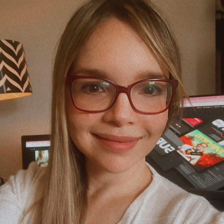

2/Brand story.
In the pre-COVID era, my partner Girling Marquez and I embarked on a journey to revolutionize branding. With my graphic design background and Girling’s expertise in client relations, we founded Bcombrand. Our mission? To prioritize Corporate Brand Identity. From conceptualizing brand values to delivering effective campaigns, we blend creativity, strategy, and humor.
Join us as we foster meaningful relationships between clients and their audience.
SKILLS.
#Creative Thinking
# Visual Arts
# Corporate
3/The logo.
Crafting our logo is like sculpting the face of our corporate brand identity—it embodies everything we stand for. It’s our signature, instantly memorable and adaptable across platforms.
Our logo is our chance to shine and leave a lasting mark, so we’re committed to creating one that captures the essence of our brand authentically.
3.1/ Logo applications.
The importance of strictly adhering to the correct usage of a logo cannot be overstated. Consistency in its application ensures brand recognition and maintains brand integrity. By following established guidelines for spacing, proportions, and color, the logo retains its visual impact across various mediums and contexts. This consistency instills trust and credibility in the brand, reinforcing its identity and enhancing its overall effectiveness in communicating with the audience.
Allowed usages of the BCOMBRAND logos.
Be sure to respect the empty spaces around the logo, this is meant to keep the clean and sleek look in every publication that shows out most important asset. This is the grid we defined to ensure the quality and consistecy.
Using white logo over black background.
Using black logo over white background.
Using white logo over color background.
4/The colors.
Crafting our logo is like sculpting the face of our brand—it embodies everything we stand for. It’s our signature, instantly memorable and adaptable across platforms. Our logo is our chance to shine and leave a lasting mark, so we’re committed to creating one that captures the essence of our brand authentically.
5.1/PRIMARY TYPE.
We have one typeface we use for all of our headlines: Rubik Featuring many fine details, moderate contrast and slightly unusual anatomy, the typeface can be a loud and proud hero or a humble supporting actor for all sorts of designs.
Rubik Bold by Google fonts.
First Impression Matters.
Rubik Regular by Google fonts.
Company vs Brand.
5.1/SECONDARY TYPE.
Our secondary typeface is Abhaya Libre is used across all body copy when we need to be a bit more clear and digestible versus expressive.
Abhaya Libre by Google fonts.
Branding is Everything.
5.2/TYPE HIERARCHY.
The type hierarchy in graphic compositions is crucial for guiding the viewer’s attention and conveying information effectively. By strategically organizing fonts based on factors like size, weight, and style, designers can create visual hierarchy, highlighting key elements and establishing a flow of information. This hierarchy ensures that the most important messages are prioritized and easily digestible, ultimately enhancing the overall clarity and impact of the corporate brand identity. Please ensure to use the following examples as guidance.
Headline: Rubik Bold / 60px.
Incredible simple.
Subline: Rubik Normal / 30px.
Branding is what people says when you leave the room.
Body Copy: Abhaya Libre / 20px.
Public speaking can be a nerve-wracking experience. A less than confident delivery can lead to stuttering, anxiety, and a lack of engagement from the audience, ultimately hindering the effectiveness of the presentation. SpeechEase alleviates those concerns, empowering speakers to deliver their message with clarity and confidence, ultimately captivating their audience and achieving success in both the short term and the long run.
6/IMAGERY STYLE.
The style of photography or illustration used in brand materials. Imagery should align with the brand’s personality and values, whether it’s sleek and modern, warm and inviting, or bold and dynamic.


7/SOCIAL NETWORK STORIES.
The style of photography or illustration used in brand materials. Imagery should align with the brand’s personality and values, whether it’s sleek and modern, warm and inviting, or bold and dynamic.

Valuable Content.

Trending Content.

Service Sales Content.

Sponsored Content.