SCNRY BRAND GUIDELINES
The Origins.
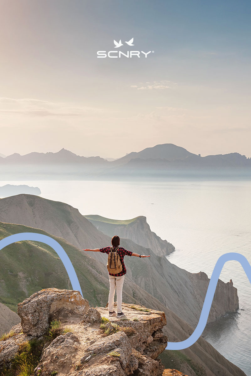
After experiencing the breathtaking landscapes of Washington State, Zuleima fell in love with them and decided to share her adventures with family and friends. The positive feedback she received transformed her experiences into a lifestyle. Inspired, she founded SCNRY, a brand rooted in sustainability and performance. After careful planning, Zuleima and her sister launched a hiking apparel line that reflects the emotions and memories of the places that touched their hearts. After countless hours of dedication and hard work in creating the brand, we proudly present it to everyone the Scnry Brand Guidelines .
The Isotype.
Crafting our logo is like sculpting the face of our corporate brand guidelines —it embodies everything we stand for. It’s our signature, instantly memorable and adaptable across platforms.

The Logo.
The brand’s symbol features two pica pica birds, known for their intelligence, monogamy, and longevity. Their vocalizations to hikers symbolize communication, adding a romantic essence. The birds’ flexible positioning brings dynamism to the logotype, enabling a broader portrayal of landscapes.

The Logotype.
The importance of strictly adhering to the correct usage of a logo cannot be overstated. Consistency in its application ensures brand recognition and maintains brand integrity.
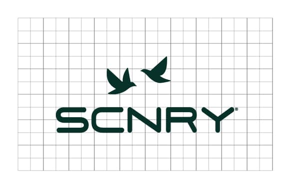
Logotype Grid & Margins.
The importance of strictly adhering to the correct usage of a logo cannot be overstated. Consistency in its application ensures brand recognition and maintains brand integrity. By following established brand guidelines for spacing, proportions, and color, the logo retains its visual impact across various mediums and contexts. This consistency instills trust and credibility in the brand, reinforcing its identity and enhancing its overall effectiveness in communicating with the audience.

The Color Palette.
Crafting our logo is like sculpting the face of our brand—it embodies everything we stand for. It’s our signature, instantly memorable and adaptable across platforms. Our logo is our chance to shine and leave a lasting mark, so we’re committed to creating one that captures the essence of our brand authentically.
Official Typography.
We have one typeface we use for all of our headlines: POPPINS. Featuring many fine details, moderate contrast, and slightly unusual anatomy, the typeface can be a loud and proud hero or a humble supporting actor for all sorts of designs. This choice is a key part of our brand guidelines, ensuring consistency and cohesion across all visual communications.
Poppins Normal by Google fonts.
Answers Lie in Movement.
Poppins Medium by Google fonts.
It is beautiful up there!
Abhaya Libre by Google fonts.
Meet the great outdoors.
TYPE
HIERARCHY.
The type hierarchy in graphic compositions is crucial for guiding the viewer’s attention and conveying information effectively.
(H1) Headline Poppins Normal 60 px.
Answers lie in movement.
(H2) Subline Poppins Medium 25 px.
IT IS BEAUTIFUL UP THERE!
(P) Body Copy Abhaya Libre Medium18 px.
Public speaking can be a nerve-wracking experience. A less than confident delivery can lead to stuttering, anxiety, and a lack of engagement from the audience, ultimately hindering the effectiveness of the presentation. Speech Ease alleviates those concerns, empowering speakers to deliver their message with clarity and confidence, ultimately captivating their audience and achieving success in both the short term and the long run.
Iconography Resources.
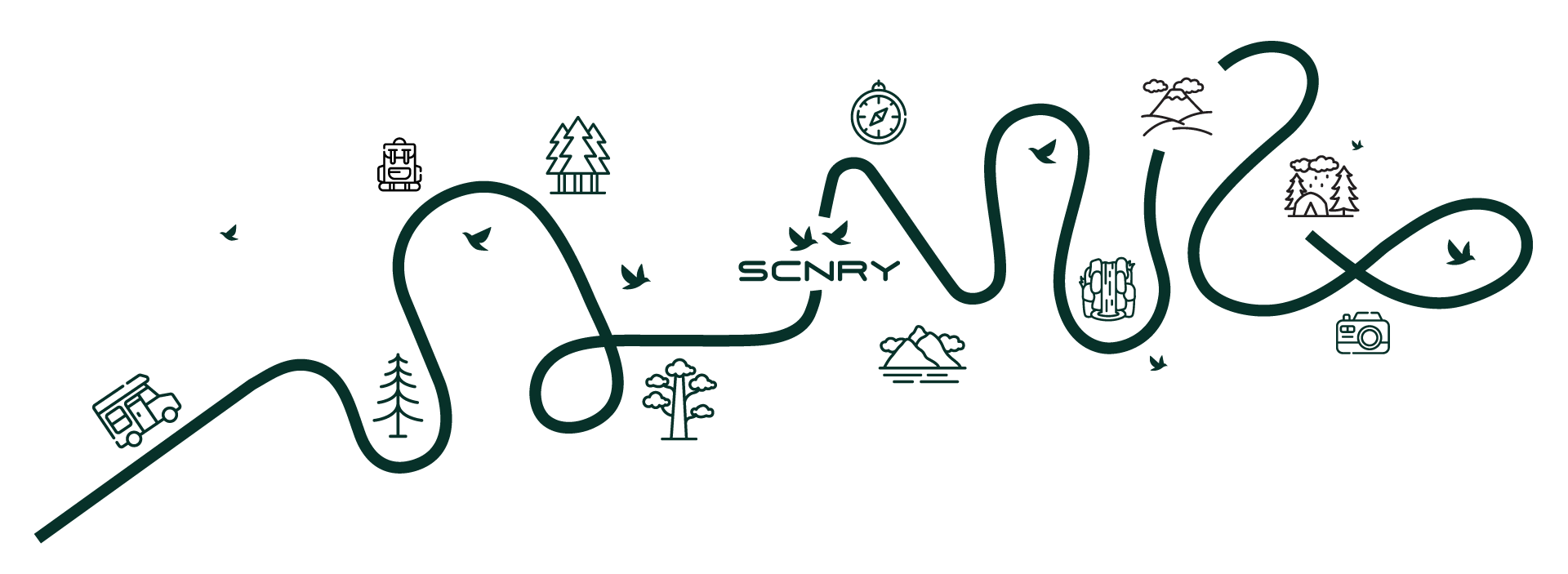
The style of photography or illustration used in brand materials is a key element of the brand guidelines. Imagery should align with the brand’s personality and values, whether it’s sleek and modern, warm and inviting, or bold and dynamic. This ensures consistency and reinforces the brand’s identity across all touchpoints.
Icon Application.
The style of photography or illustration used in brand materials. Imagery should align with the brand’s personality and values, whether it’s sleek and modern, warm and inviting, or bold and dynamic. Imagery should align with the brand’s personality and values, whether it’s sleek and modern, warm and inviting, or bold and dynamic.

Brand’s Imagery
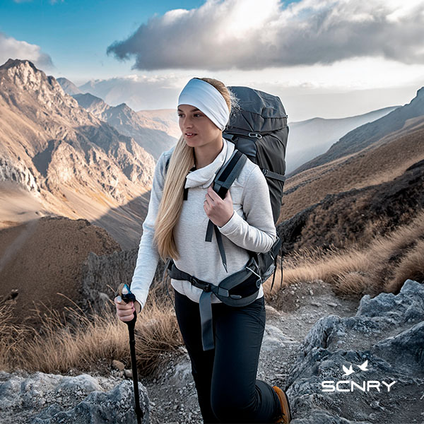
The style of photography or illustration used in brand materials. Imagery should align with the brand’s personality and values, whether it’s sleek and modern, warm and inviting, or bold and dynamic.
Amazing Scenaries.
The style of photography or illustration used in brand materials. Imagery should align with the brand’s personality and values, whether it’s sleek and modern, warm and inviting, or bold and dynamic. Imagery should align with the brand’s personality and values, whether it’s sleek and modern, warm and inviting, or bold and dynamic.
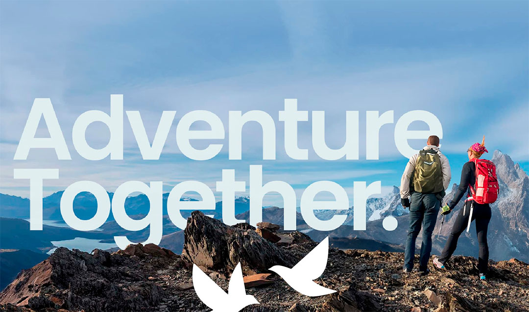
Imagery Rules for Amazon.com Store
“Developing this brand for a hiking apparel company was an exhilarating journey. In a competitive outdoor market, we crafted a distinctive visual identity that resonated with adventurers. Our focus on quality, durability, and connection with nature ensured the brand stood out and thrived.”


