A Fresh Rebranding.
A Fresh Restart
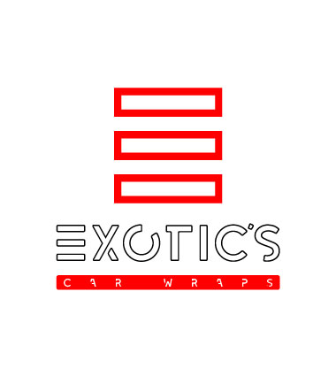
former logotype
BACKGROUND: Exotic’s Car Wraps is a company that has more than 5 years of experience in the automotive and commercial segment. Their extensive experience in the area was not reflected in the logo they had.
Pros:
- Name recognized in the city where they operate.
- The term “Exotic’s” is typical of the vehicles with which they usually work.
- Goes straight to the point
Cons:
- The Tagline leaves out the Commercial Wraps business.
- Reading is difficult, especially in print media.
- Does not denote artistic talent.
Essential customer requirements:
“We need to be a creative looking brand to stay competitive in today’s marketplace. We are not afraid of changes.”
“We required a look that evokes great innovators in the industry, specifically from the West Coast of the US.”
“Our name can change but we must not lose the original essence. We will maintain the tradition and experience that identifies us as professionals.”
Who is the Buyer Person according to the services they offer?
Potential clients may be interested in its 2 main services: CUSTOM WRAPS and COMMERCIAL WRAPS & WALLPRINTS. Both market segments have different consumption habits, but are searching for a common element: Quality and Creativity. Every time we take these variables into account, we can undoubtedly designate 2 clearly defined consumer profiles:
Custom Wraps
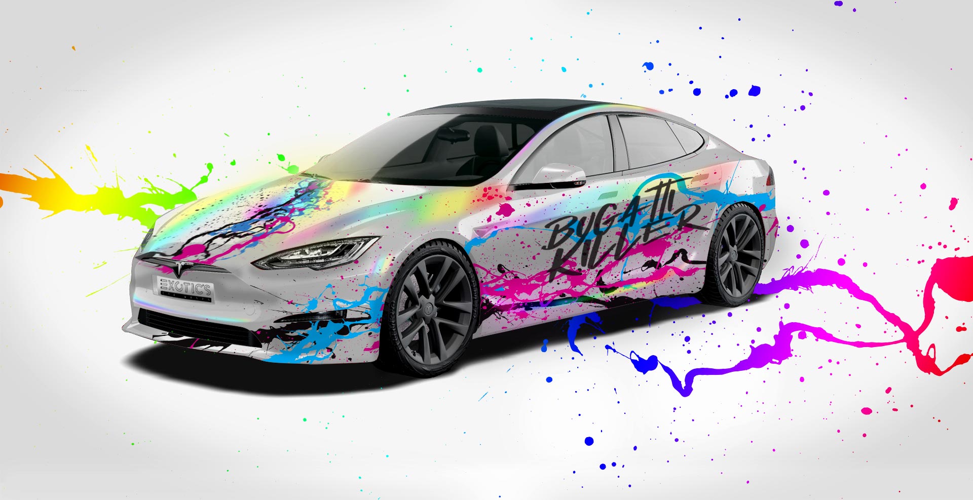
- People who wants to be a focus of attention.
- Stand out in their environment.
- They own high-end vehicles,
- Public Figures.
- Exclusive.
Client type:
Influential personalities between 18-35 years old.
Commercial Wraps
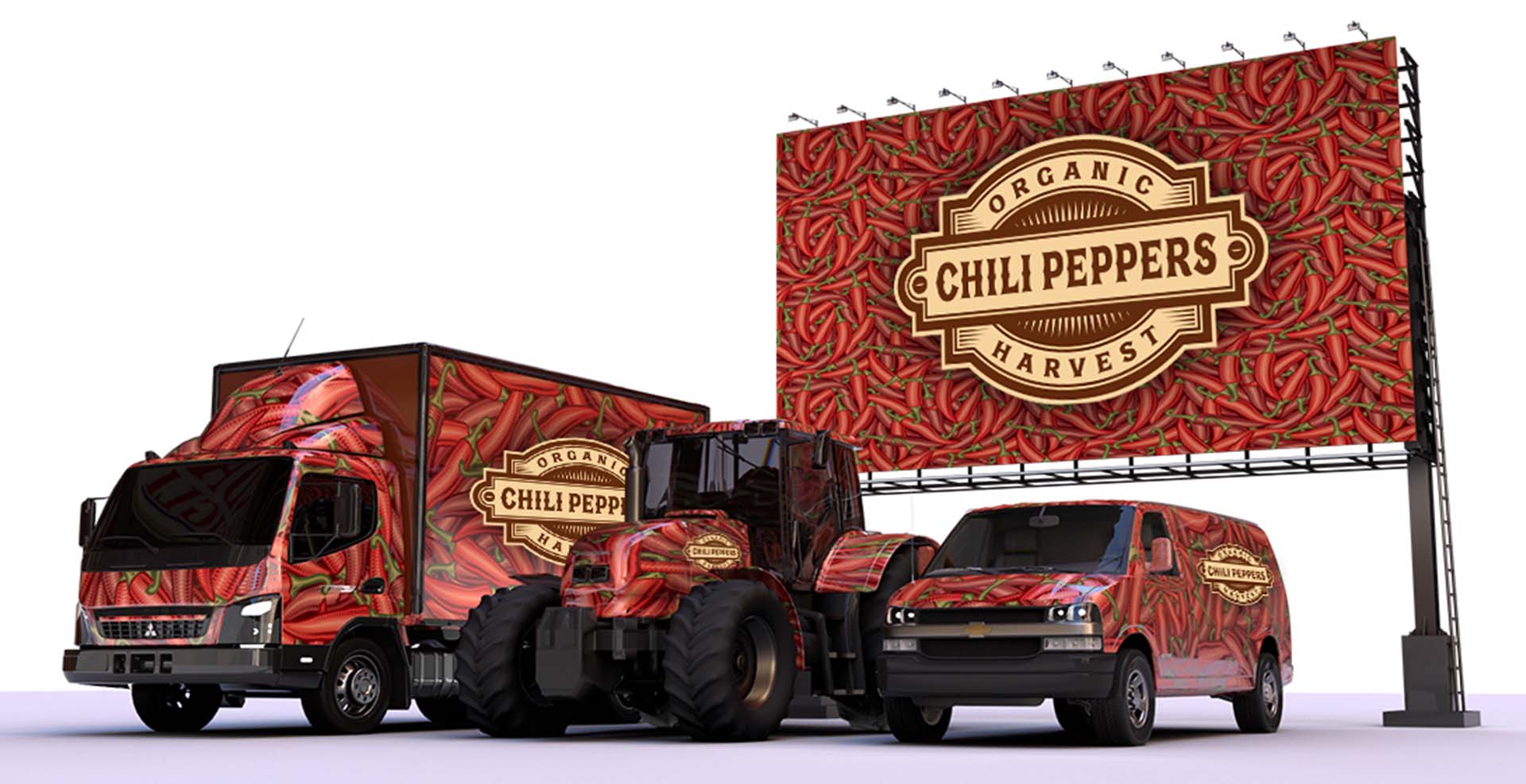
- Organizations and companies who owns fleet.
- The want to get exposed on potential clients.
- They are in constant growth.
- Requieres A+ quality products.
- Afrodable.
Client type:
Entrepreneurs and mechants from 36 to 50 years old.
1st. Step: REFORMULATION OF THE BRAND NAME AND TAGLINE.
Client says:
“We love our main name “EXOTIC’S, but Car Wraps leaves out the segment of advertising billboards, which is one of the most profitable services we have in the company. Without a doubt, we want to maintain the tradition but it is extremely important that we cover both segments equally.”
BCOMbrand answer:
“¡Of course, we had already noticed that problem in the name of your prestigious company, we will immediately assign this task to our creative team to brainstorm ideas and come up with a name that includes both services!”
The new Name and the TagLine will be conceptualized to fully cover both market segments that they want to attack without losing the essence that identifies them as a company that exudes creativity and quality in its products and services.
EXOTIC WRAP CUSTOMS™
Tagline: We make you stand out!
1st. Step:
REFORMULATION OF THE BRAND NAME AND TAGLINE.
Client says:
“We love our main name “EXOTIC’S, but Car Wraps leaves out the segment of advertising billboards, which is one of the most profitable services we have in the company. Without a doubt, we want to maintain the tradition but it is extremely important that we cover both segments equally.”
BCOMbrand answer:
“¡Of course, we had already noticed that problem in the name of your prestigious company, we will immediately assign this task to our creative team to brainstorm ideas and come up with a name that includes both services!”
The new #Name and the #TagLine will be conceptualized to fully cover both market segments that they want to attack without losing the essence that identifies them as a company that exudes creativity and quality in its products and services.
EXOTIC WRAP CUSTOMS ™
We make you stand out!
2nd. Step: COLOR PALETTE SELECTION.
Client says:
“Our favorite color is Red, because it is the most chosen color among sports cars, now we want a palette that identifies with the city of Miami”
BCOMbrand answer:
“Perfect, we will study the cultural diversity of the city to obtain a palette that is in accordance with its area of influence!”
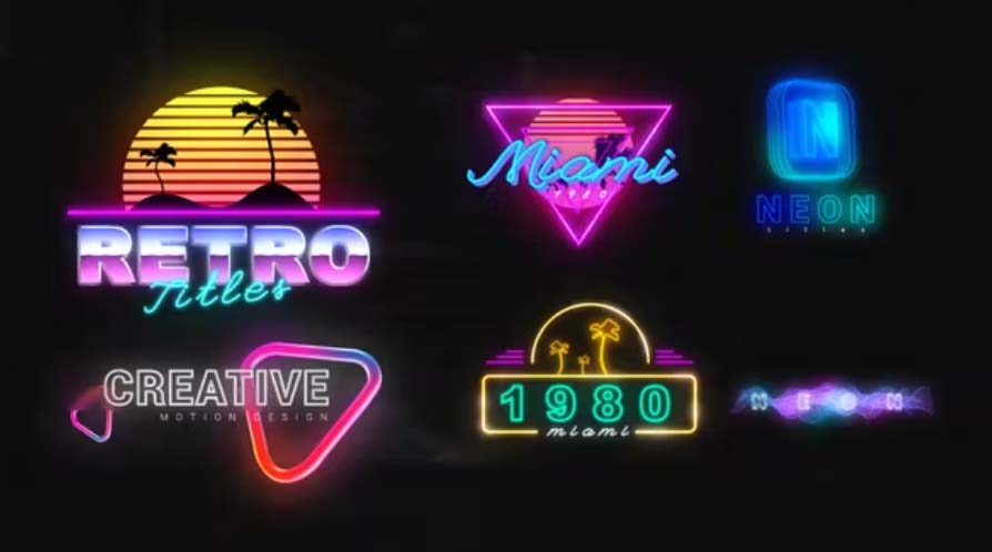
The colors of the most vibrant city in the USA
Rich in cultural diversity, a city full of contrasting colors, inspired by skies of unimaginable blue and pink gradients, it is a city that wakes up at night and explodes in the beauty of its neon-lit streets that invite unrestricted fun.
The selected color range reiterates the presence of a pleasant, hot and cool climate that allows its inhabitants and visitors to enjoy unforgettable moments among a diversity of multicultural nuances.
MIAMI

MIAMI

3rd. Step: REALIZATION OF THE LOGO.
Client says:
“Over the years we have discovered that the tastes and consumption habits of our 2 types of clients (Personal and Corporate) are diametrically different. Is there a solution for this condition that is so important for our company?”
BCOMbrand Answer:
“That is very valuable information, our branding specialists will surely find an answer that fully satisfies you. Thanks for trusting us!”
We have developed 2 versions of the logo, with common elements, but markedly differentiated to identify with the 2 types of clients that we have previously described.
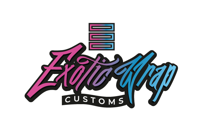
Custom Wraps Logo
Aimed at influential personalities who seek to stand out in their environment.
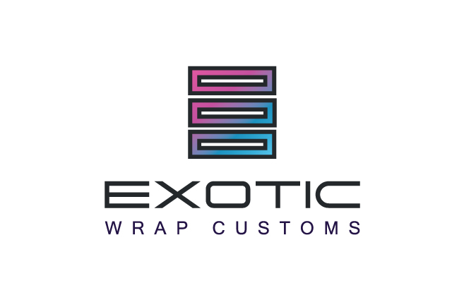
Commercial Wraps Logo
Aimed at companies that want to position their corporate image.
3er. Paso:
REALIZATION OF THE LOGO
Client says:
“Over the years we have discovered that the tastes and consumption habits of our 2 types of clients (Personal and Corporate) are diametrically different. Is there a solution for this condition that is so important for our company?“
BCOMbrand Answers:
“That is very valuable information,our branding specialists will surely find an answer that fully satisfies you. Thanks for trusting us!”
We have developed 2 versions of the logo, with common elements, but markedly differentiated to identify with the 2 types of clients that we have previously described.

Custom Wraps Logo
Aimed at influential personalities who seek to stand out in their environment.

Commercial Wraps Logo
Aimed at companies that want to position their corporate image.
This rebranding project was intense due to the client’s unique characteristics, which included creative traits and an aesthetic sense that was challenging to grasp. Ultimately, the client entrusted me with the visual look and feel of their company, resulting in a satisfying outcome that will undoubtedly boost their product and service sales.


