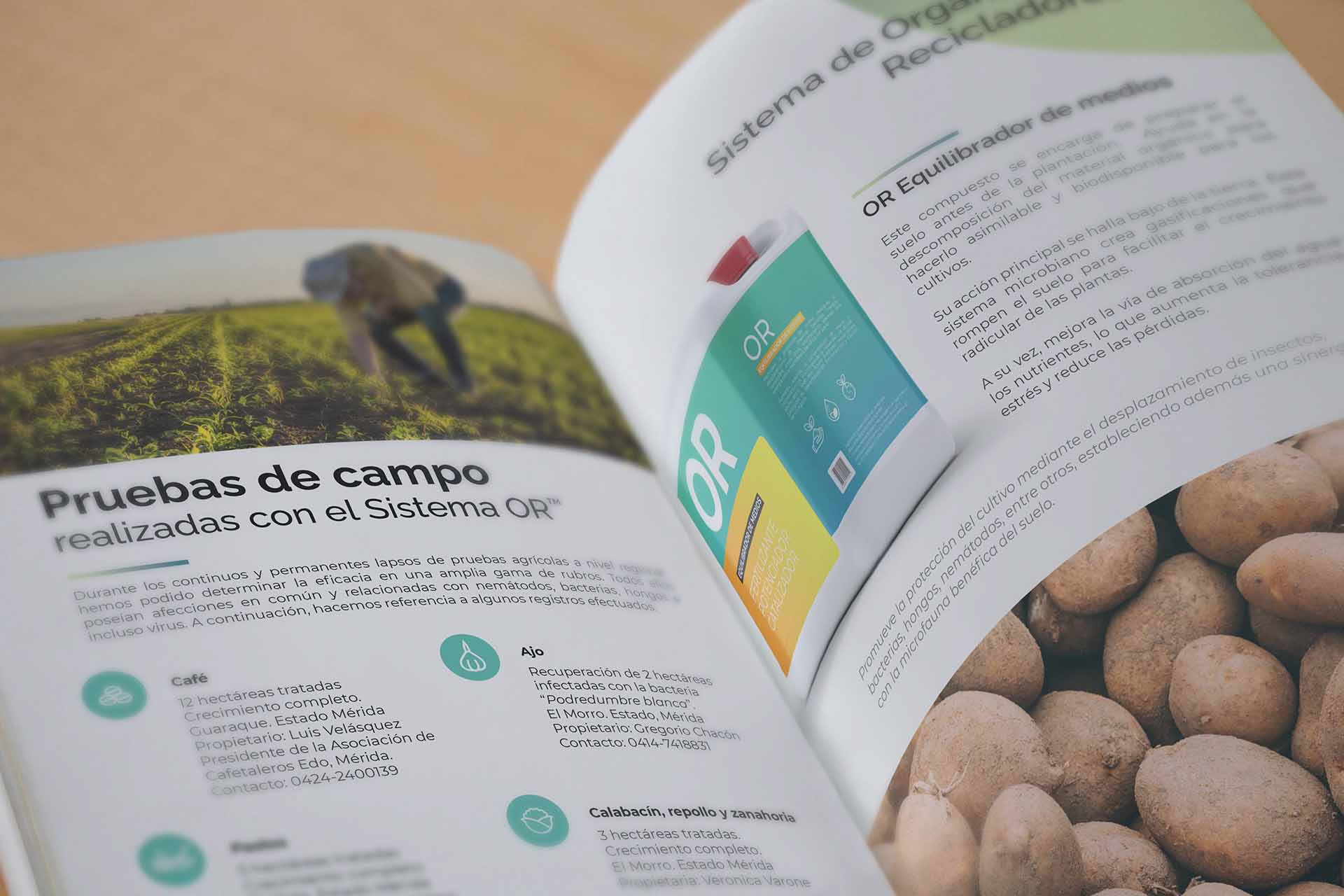
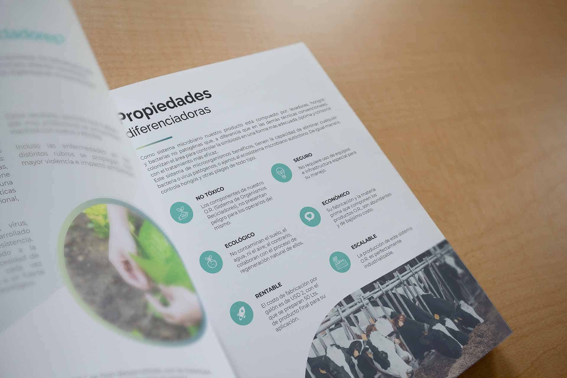
The creation of an environmentally conscious brand.
Discover the considerations that shaped the creation of a reliable brand for this company, developers of a system consisting of three elements: media balancer, fertilizer, and pest repellent for food producers. This study explores key aspects such as safety compliance, transparency, environmental responsibility, and crisis management.
Join us as we delve into how we successfully overcame these challenges to establish a brand that prioritizes food safety and consumer trust.
What are Non-Pathogenic Bacteria?
They are beneficial microorganisms that do not cause diseases in plants, animals, or humans. These bacteria play a vital role in agriculture by promoting soil health, improving nutrient absorption, and protecting plants from diseases.
Their use in food production and sustainable agriculture is increasing due to their ability to reduce reliance on harmful chemicals, thereby enhancing environmental health and food safety.

First, the concept, then the design.
How does the company want to be perceived?
The creators of this technology want to convey their achievements aimed at providing a system that addresses the old paradigms of the food industry: efficient yet responsible production.
Who is the target audience?
The potential clients of this system are both large and small producers who are aware of the harmful effects of agrochemicals currently used in the agriculture industry.
Conveying the company’s values.
Safety and regulations:
Food safety must be an absolute priority. Ensure compliance with all regulations and standards related to food production and handling to guarantee product safety.
Research and Development:
Conduct thorough research to understand the characteristics, benefits, and risks associated with the non-pathogenic bacteria used in food products. This will enable the development of safe and effective products.
Brand Voice:
It is essential to establish clear and transparent communication with consumers and stakeholders. Provide accurate information about the products, their composition, and the production processes used.
Inventor’s Vision
The vision of the inventor is to transform the industry by providing innovative solutions that enhance efficiency and sustainability, addressing longstanding issues with traditional practices and advancing food production responsibly At our company, we are committed to leading the transformation of the agrochemical industry by promoting environmentally friendly practices and consumer health. We work tirelessly to provide sustainable and safe solutions that protect crops without compromising ecological balance.
“We are dedicated to creating a healthy and sustainable agricultural future for everyone.”
The Archetype
“The ‘Caregiver’ archetype was chosen for this product due to its association with protection, health, and well-being. It reflects the commitment to nurturing the land, plants, and living beings, offering safe and sustainable solutions for healthy and environmentally friendly agriculture.”

The Logotype
It should be simple yet convey purity, which is the fundamental and distinguishing factor of this product compared to other agrochemical products used in the industry.
A clean font, based on the Raleway typeface, was used—sans-serif and highly symmetrical—to reduce visual weight and ensure that the product’s initials are legible even in smaller applications such as business cards or industrial sample labels.
Together, the logo conveys a sense of innovation, vitality, and commitment to the environment.
The Color Palette
Colors are a crucial element, as they impact emotions and convey the company’s values. They create connection, differentiation, and trust with the audience, building a strong and memorable visual identity. Colors should align with the brand’s objectives and values to be effective.

Respectful Green: Represents harmony with nature and sustainability. Inspired by forest freshness, it highlights a commitment to a greener, more conscious future.
RGB: 99,200,142
HEX: #63c88e
CMYK: 60%,0%,60%,0%
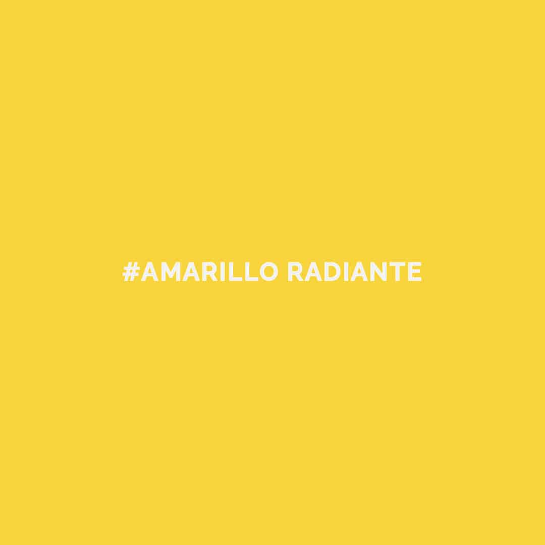
Radiant Yellow: Represents energy in eco-friendly agriculture. Linked to beneficial bacteria, it highlights soil health. Discover this vibrant, environmentally friendly option.
RGB: 248,212,61
HEX: #f8d43d
CMYK: 3%,13%,87%,0%

Healthy Pink: Harmonious color in sustainable agriculture. Symbolizes ecosystem balance and vitality. Experience its power with non-pathogenic bacteria, our choice for healthier farming.
RGB: 249,179,154
HEX: #f9b39a
CMYK: 0%,35%,35%,0%
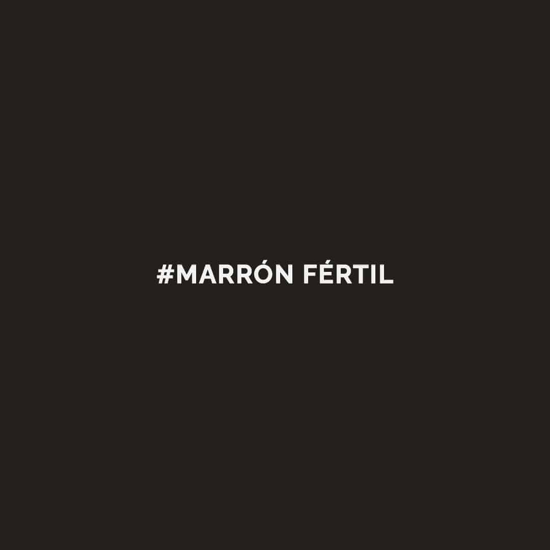
Fertile Brown: An earthy color symbolizing fertility and sustainable growth in eco-friendly agriculture. Inspired by fertile soil, it’s a green choice for thriving, sustainable farming.
RGB: 36,32,28
HEX: #24201c
CMYK: 68%,65%,68%,74%
Corporate Identity
Packaging should reflect the brand’s values, being fresh and professional. Colors should harmonize with nature, and the design should be clean. Include a distinctive logo and ensure consistency in packaging, online presence, and communications. Convey a commitment to eco-friendly agriculture.
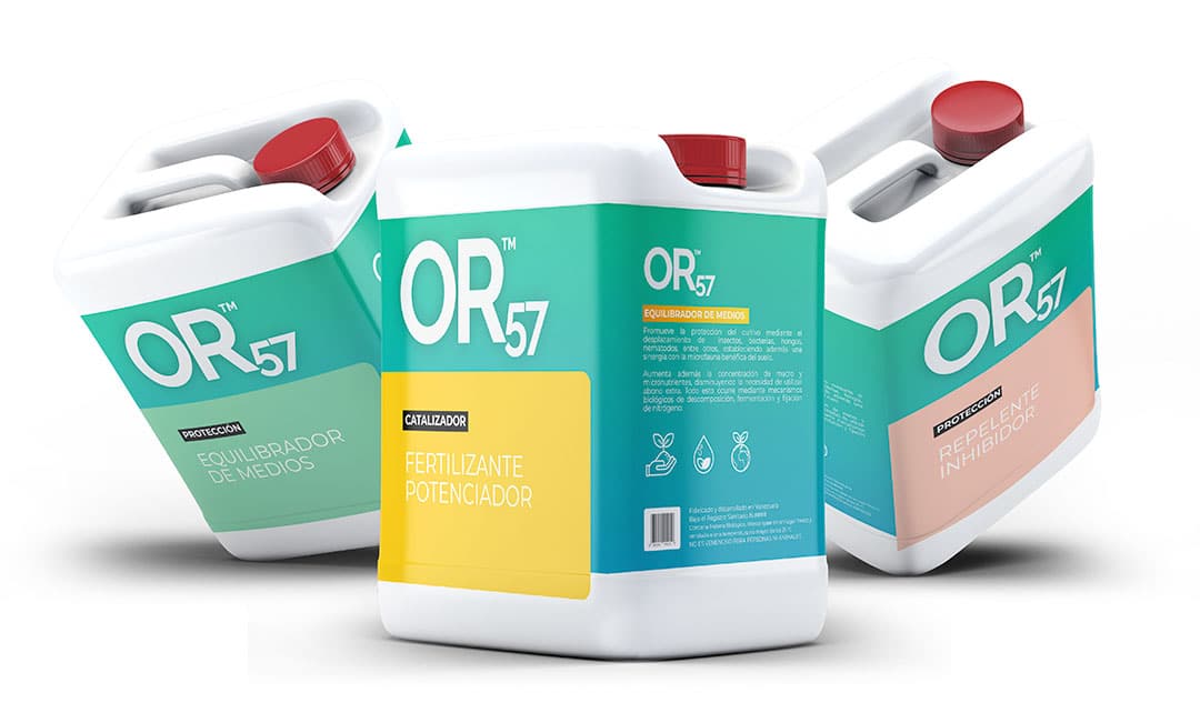
The creation of this corporate image was a very enjoyable journey. The brand’s core values resonate with those of us who appreciate nature. It was a challenge to understand the complexity of this product, but the result undoubtedly aligns with the inventor’s vision. I foresee much success for this company.


