Eco-Friendly Brand Identity.
Context and Objective.
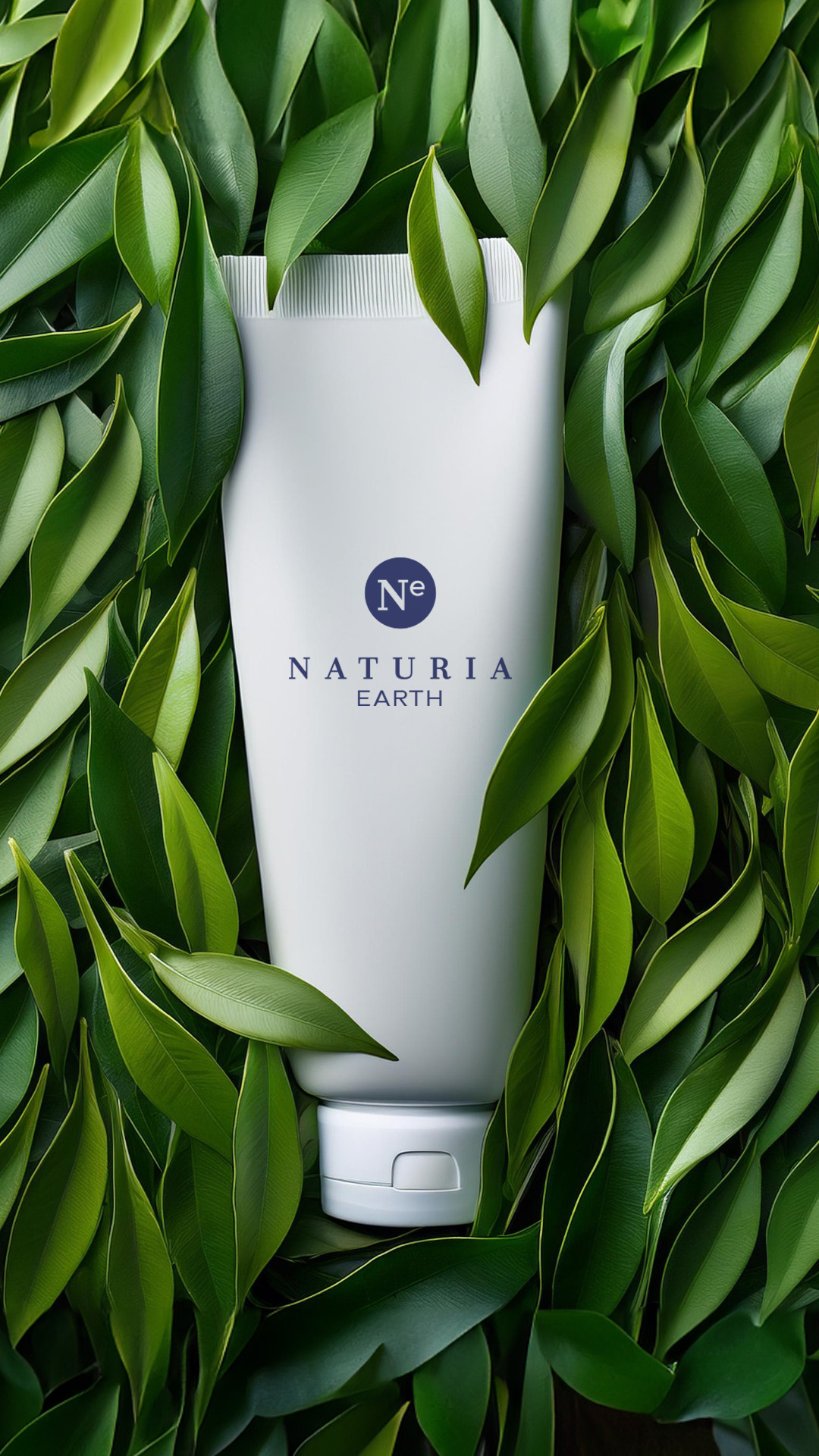
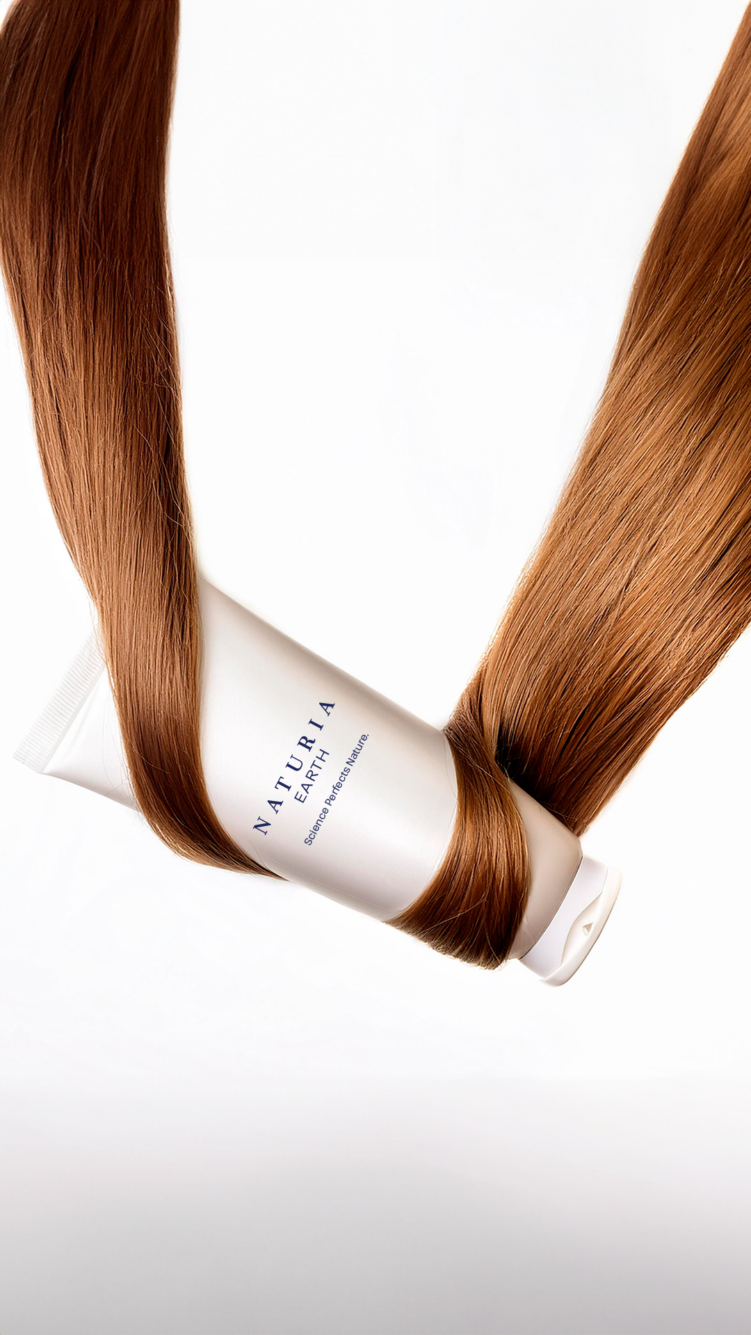
Imagine a realm where science and nature join forces to redefine hair care and build a powerful Brand Identity. Naturia Earth is an eco-friendly hair care brand specializing in keratin treatments that transform hair into silky, smooth perfection—as if nature itself lent a hand. Using low-impact, natural ingredients like refreshing aloe vera and invigorating green tea, Naturia Earth appeals to women seeking authenticity and high-performance care. In a marketplace flooded with generic, model-driven imagery and overdone aesthetics, our challenge was to create a modern and search-friendly visual identity that feels as genuine as a breath of fresh country air.
The Slogan.
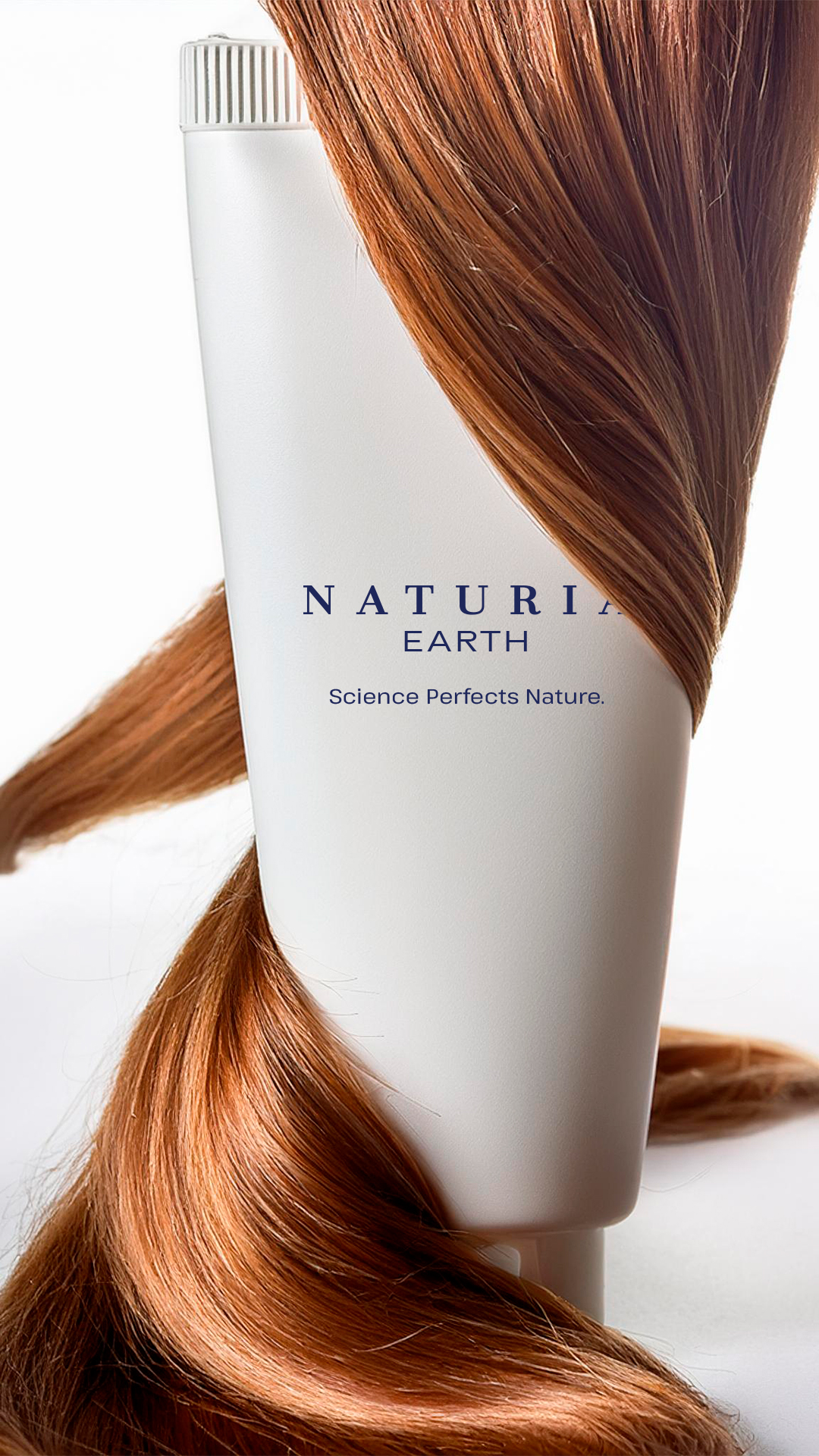
“Science Perfects Nature”
Our creative journey began with an original, SEO-friendly slogan developed entirely by our team. This powerful mantra captures the essence of enhancing nature through scientific innovation, serving as the cornerstone of Naturia Earth’s Brand Identity. It ignited a creative revolution that pushed us to break free from convention and deliver a visual narrative that is both innovative and optimized for search engines.
The Logotype.
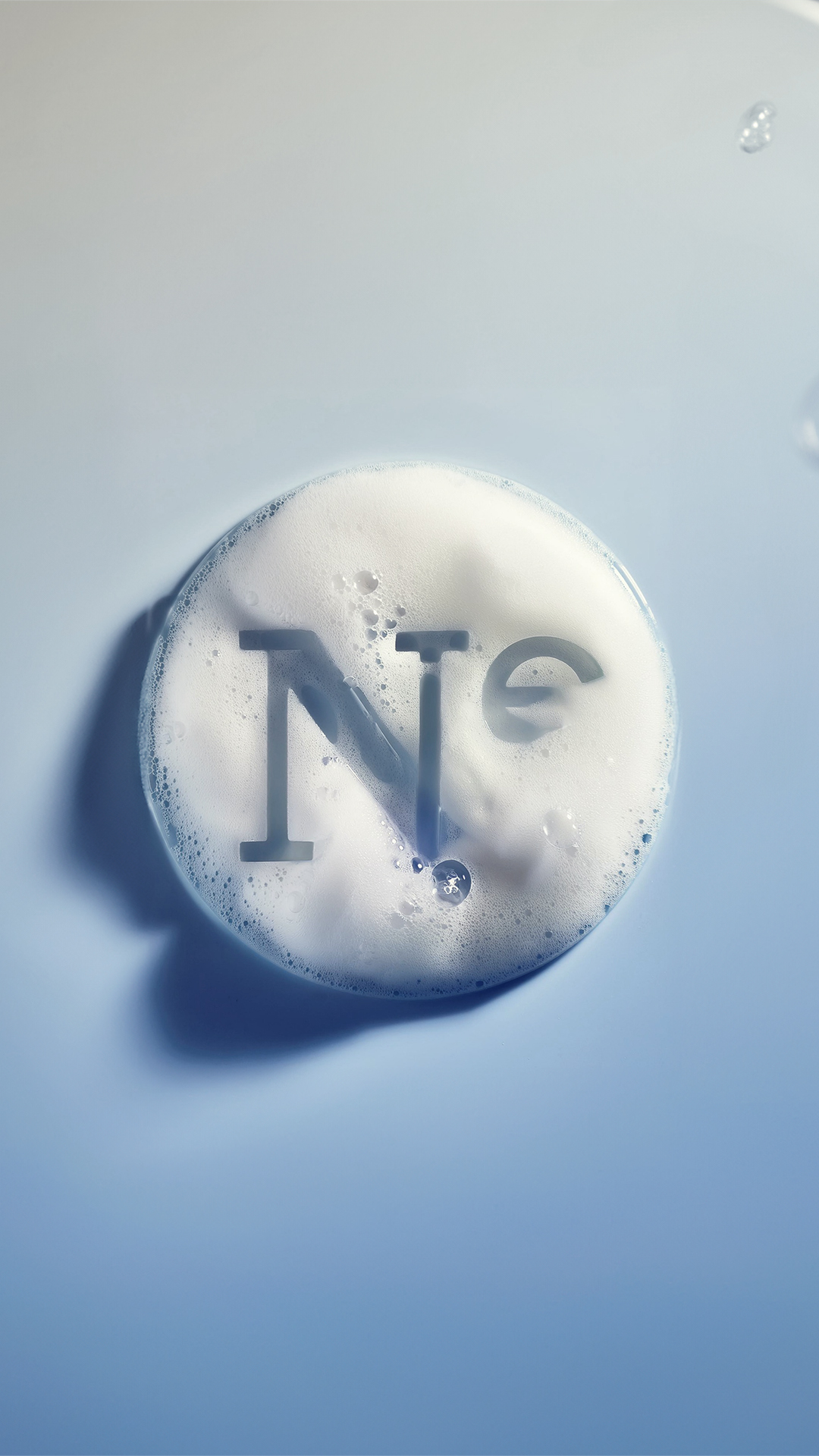
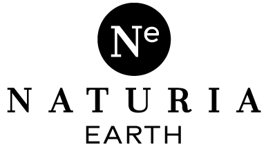
The logo is an elegant fusion of science and nature—two fundamental elements in creating a lasting Brand Identity. We crafted it around a bold capital “N” raised to the power of “e,” a clever nod to a chemical formula that symbolizes innovation in hair care branding. This minimalist yet meaningful emblem instantly conveys how science refines and elevates nature’s pure essence, making it a standout element in logo design for eco-friendly brands.
The Brand Colors.
Experience a dynamic palette that channels water’s vital flow, nature’s lush energy, and a pristine canvas, ensuring every design exudes refined elegance and timeless organic allure for lasting appeal.
Font Selection.
The typography was meticulously chosen to reinforce the modern, clean, and approachable image of Naturia Earth, strengthening its Brand Identity and ensuring optimal readability:
PRIMARY FONT
ARBUTUS SLAB REGULAR.
This modern, refined serif exudes clarity and approachability. With its clean, balanced lines and understated elegance, GACOR Regular is ideal for body copy and digital content, enhancing the overall authenticity and sophistication of the brand.
SECONDARY FONT
ARBUTUS SLAB REGULAR.
This modern, refined serif exudes clarity and approachability. With its clean, balanced lines and understated elegance, GACOR Regular is ideal for body copy and digital content, enhancing the overall authenticity and sophistication of the brand.
The Brand Deployment.
A well-crafted logo is vital for any emerging brand, serving as its visual ambassador. It truly builds trust sparks recognition, and creates a first impression that paves the way for enduring success.
Packaging Design.
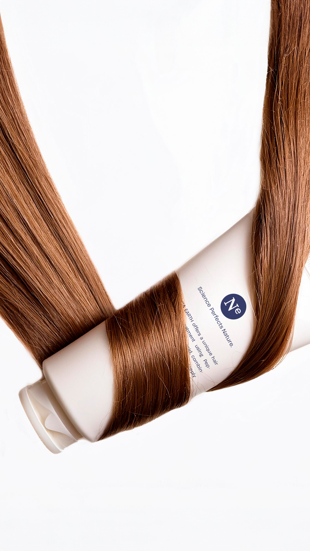
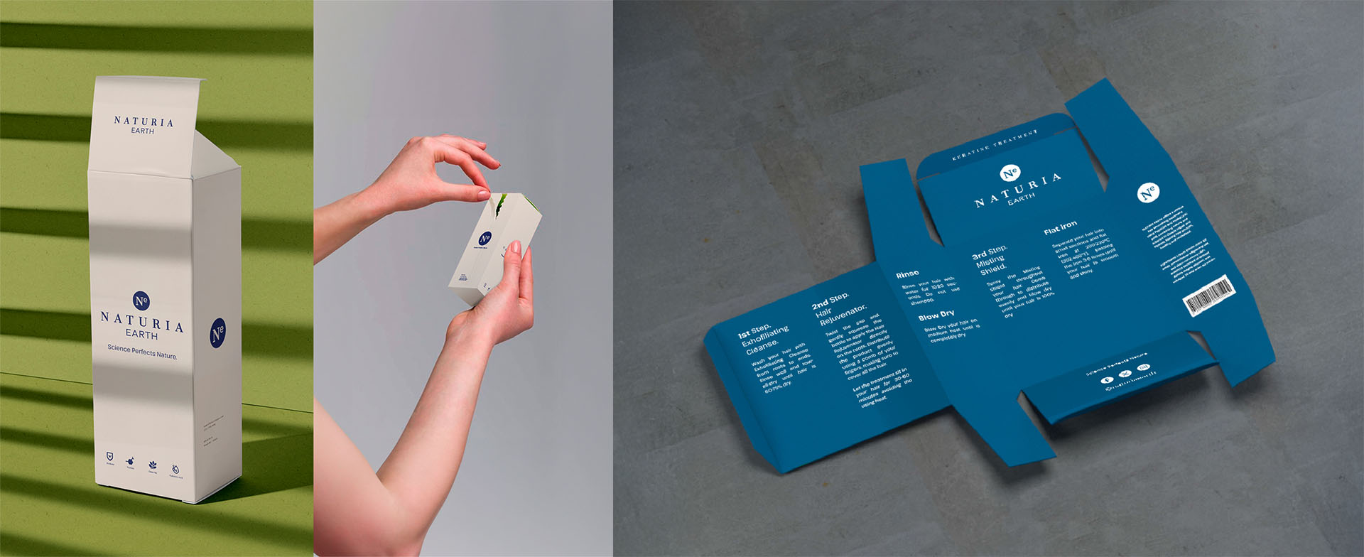
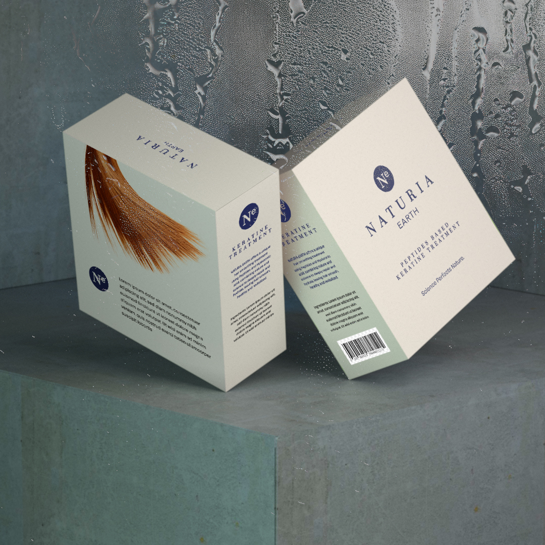
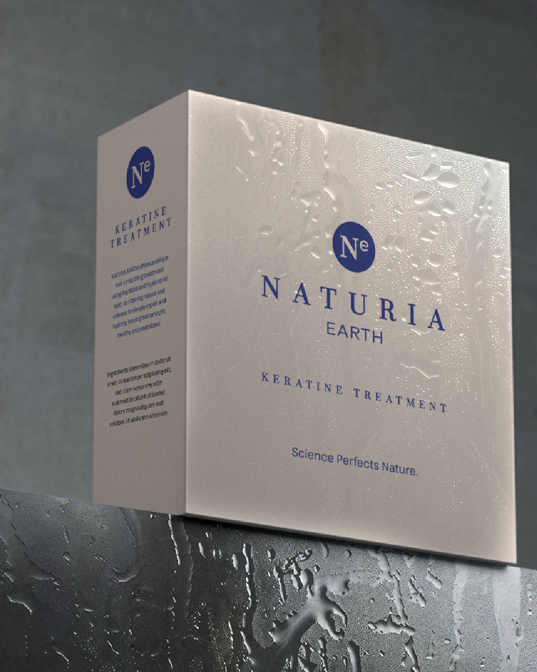
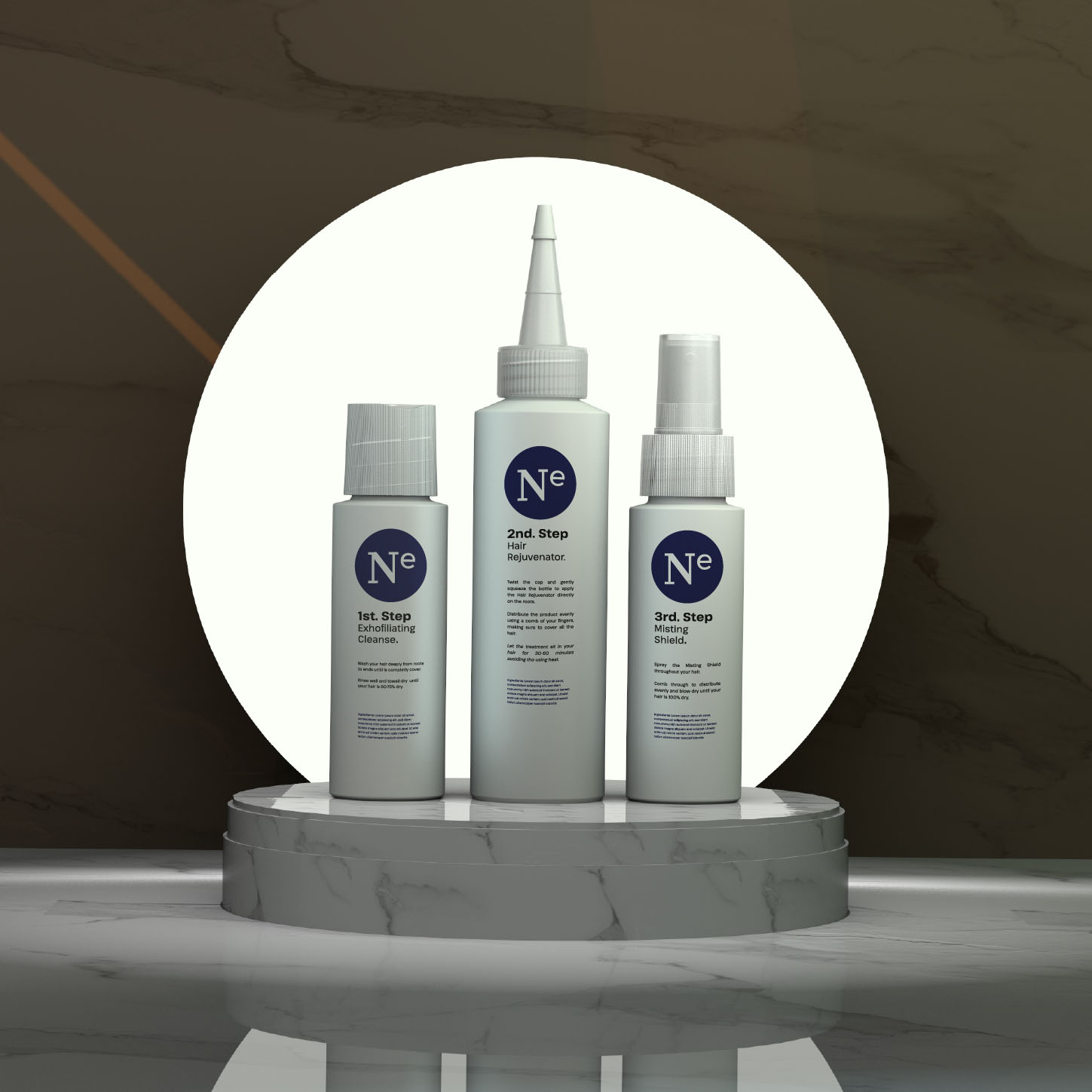
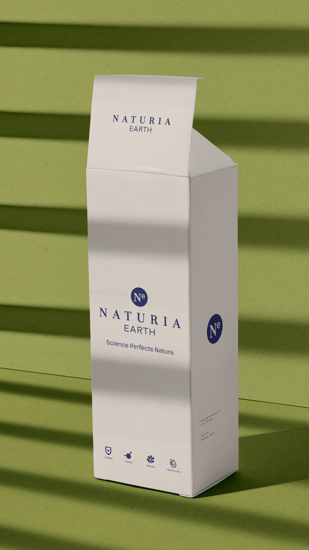
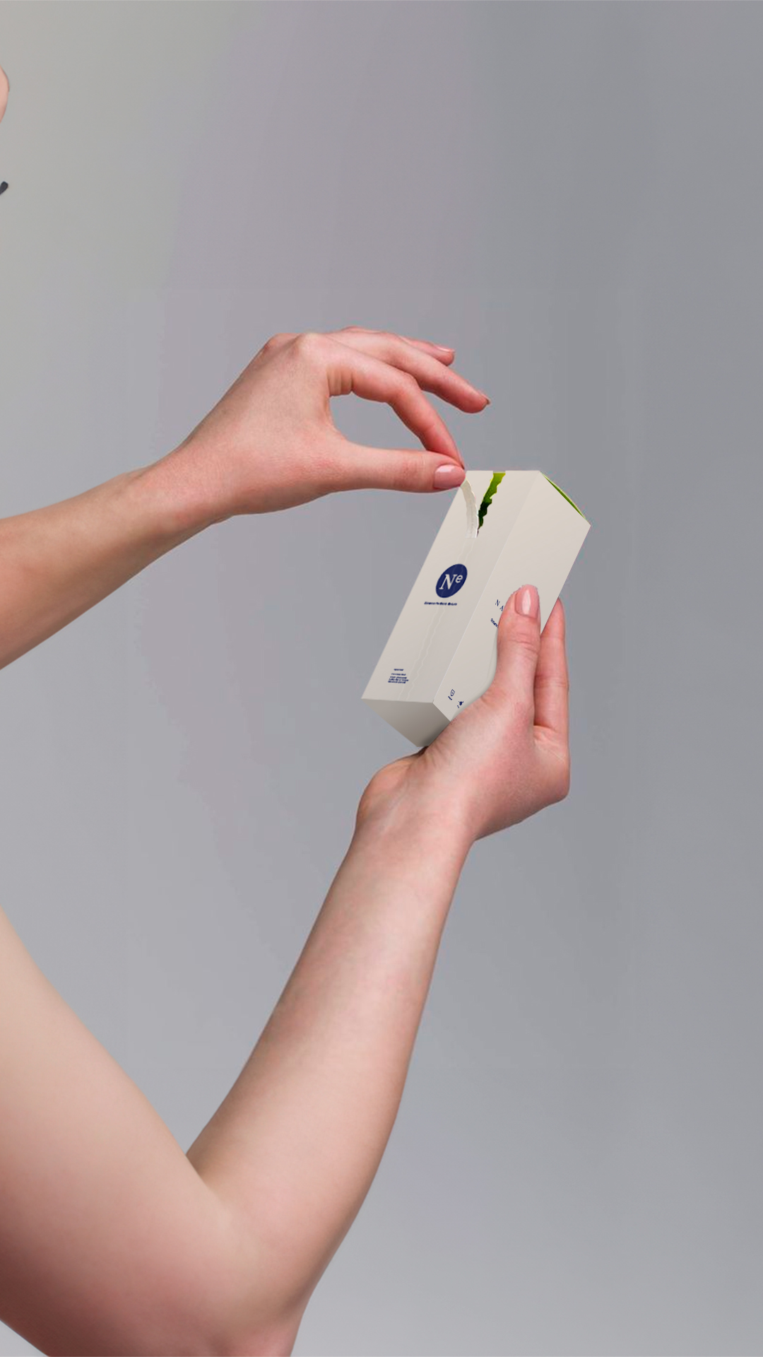
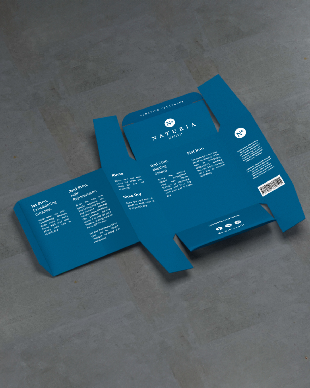
The packaging is more than just a container—it’s the brand’s first handshake with eco-conscious consumers and a vital part of its Brand Identity. Here’s how we brought this sustainable packaging design to life:

