Common Web Design Mistakes and How to Avoid Them
As someone who has built websites for years, I’ve seen the same mistakes repeated: sites with no clear purpose, overloaded designs, slow performance, and no SEO strategy. A website should be more than a pretty layout, it must be clear, functional, and credible. That’s the focus of this article.
When Design Works Against You
The design of a website can be your best ally… or your worst enemy. Many businesses invest time and money in a page that, instead of attracting customers, drives them away. The reason? Basic but lethal mistakes that reduce visibility, credibility, and ultimately sales.
The key lies in something simple but often forgotten: every website must have a clear purpose. Do you want to sell? Promote your brand? Build a community? Without that definition, any design is destined to fail. Below, we’ll look at the most common web design mistakes and how to avoid them so your digital presence is truly effective.
Common Web Design Mistakes.
One of the most frequent mistakes is believing that “more is better.” Many sites are overloaded with graphics, animations, and different fonts, creating visual confusion. Instead of communicating professionalism, they end up looking improvised.
An overloaded design not only tires users but also slows down page loading. In today’s digital era, where attention spans are minimal, one extra second of waiting can cost you a customer.
As usability expert Jakob Nielsen points out: “Users spend most of their time on other sites. This means they prefer your site to work the same way as the others they already know.”
In other words: a website doesn’t need to reinvent the wheel. It needs to be clear, easy to navigate, and inspire trust from the very first click.

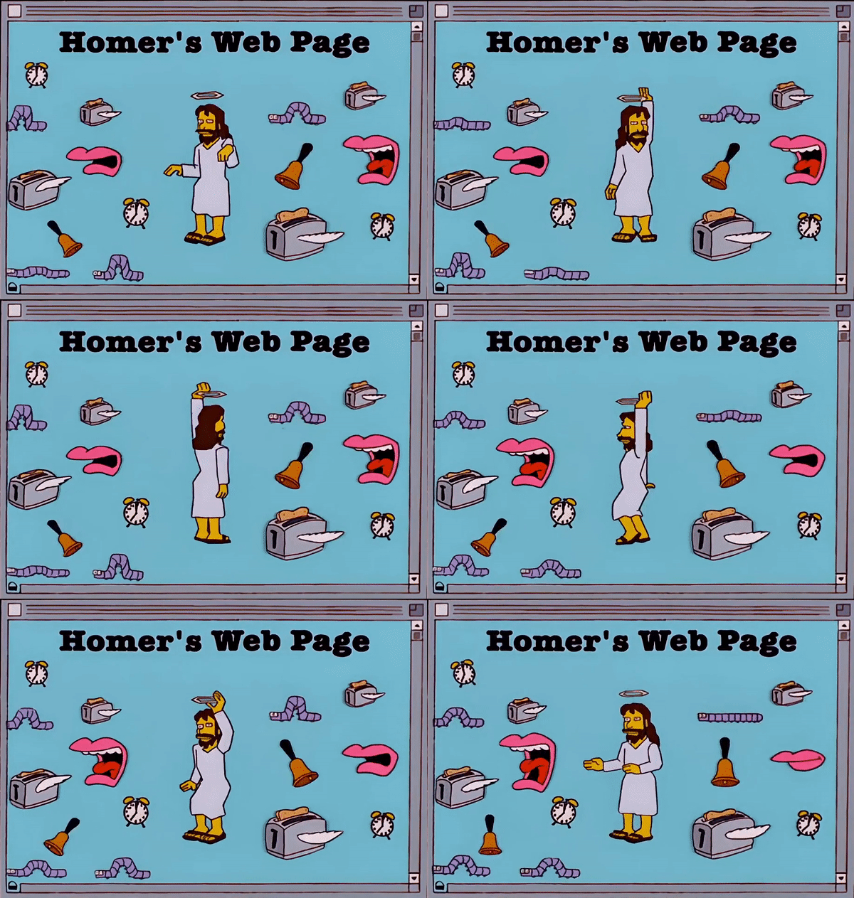
Homer Simpson’s website: even though it is clearly a satire, it’s incredible how almost 30 years later it still reflects the mindset of many business owners—filling a website with endless elements to feel it has “design and style,” while neglecting usability trends and the true purpose of a website.
Frequent Failures in Structure and Usability
Beyond visuals, many websites fail at the most basic level: usability.
-
Not being mobile-friendly: Most users access via their phones. A site that doesn’t adapt to small screens instantly loses credibility.
-
Complicated menus: If a user takes more than three clicks to find what they need, they will leave.
-
Slow loading speed: Every second counts; digital patience is scarce.
-
Lengthy forms: Asking for too much information creates friction and reduces conversion.
All these mistakes are avoidable, but they require a strategic vision: design for the user, not just for aesthetics.
The Lack of SEO: The Invisible Mistake
An even more serious mistake is ignoring SEO during web design. Many sites look attractive but are invisible to search engines and artificial intelligences.
Common SEO design mistakes include:
-
Not using strategic keywords in titles, subtitles, and text.
-
Forgetting optimized meta descriptions and slugs.
-
Failing to create relevant content that answers real user questions.
-
Neglecting semantic structure, which helps AI interpret information.
As Philip Kotler said: “The essence of marketing is understanding customer needs and responding to them.” On the web, that means designing content that both humans and algorithms can find and understand.
The Root of the Problem: Lack of Clear Objectives
Behind most mistakes lies a common issue: not defining the website’s purpose. A website cannot be everything for everyone. It needs a clear direction:
-
Sell: focused on e-commerce and conversions.
-
Promote: showcase services, portfolios, or credentials.
-
Build community: encourage interaction and loyalty.
Without clarity, the website becomes a collage of disconnected sections, mixed messages, and a design that confuses more than convinces. To this, add a common misconception: that a “good website” is one with “lots of content” and “plenty of graphics.” The truth is the opposite: a successful website is the one that balances aesthetics and functionality.
How to Avoid Them: Essential Best Practices
The good news is that most mistakes can be avoided with a strategic approach
Conclusion: A Clear Website Is a Successful Website
The most common web design mistakes are not technical or visual—they are strategic. The lack of clear objectives leads to overloaded, slow, invisible, and unreliable sites.
The solution is to go back to essentials: clarity of purpose, balance between aesthetics and functionality, and a strong SEO strategy.
A successful website is not the one with the most content, but the one that fulfills its purpose with clarity. And at BCOMBRAND, we can help you build a strategic website, free of errors and ready to deliver results.


